A stylish design that lets users understand the product
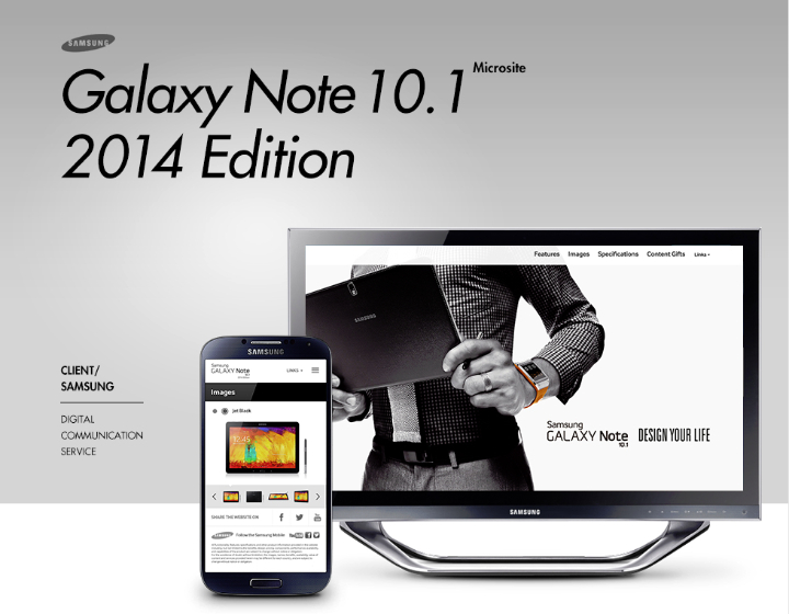
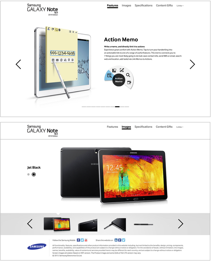
Samsung Electronics’ Galaxy Tab 10.1 2014 Edition differentiates itself from other tablets by the use of its S Pen and a large 10 inch screen. Stirring up the winds of innovation, a new Retina display features a high-resolution WGXQA screen that provides the best picture quality for any tablet on the market. designfever developed a microsite for the production and promotion of the Galaxy Tab 10.1 2014 Edition under the top-secret code name ‘N1’. The goal of the project was to effectively demonstrate the unique changes found on the Galaxy 10.1 2014 Edition to users by highlighting it’s sensual visuals, upgraded features, and revolutionary user benefits.
Clear and easy information
Many promotional sites are created so that users only click and scroll for a few second to obtain information, only experience the product indirectly. We systematically analyzed the characteristics and user trends of promotional sites to determine how we could intuitively present the tablet. We created a site that gives users more information while exemplifying the upgraded functions, and sophisticated design of the Galaxy Tab 10.1 2014 Edition.
‘Design Your Life’ brings value to the user
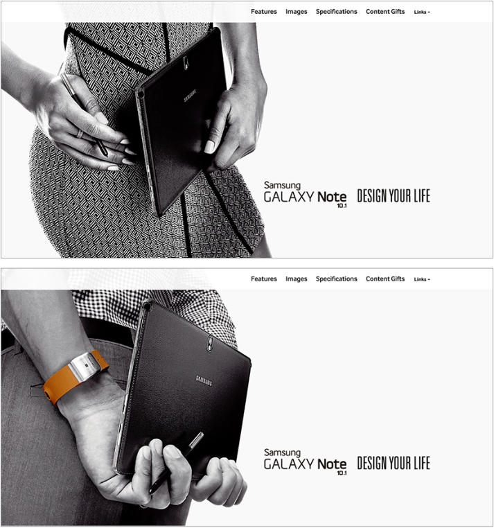
The microsite goes beyond typical close-up shots of the product in black and white that could be found in an advertisement or magazine covers. The emphasis was placed on projecting the meaningful value of the Note 10.1 2014 Edition and the way in which the user could expect to add value to their daily lives, all while highlighting its elegant design quality.
More intuitive, more sensible
Users are able to intuitively understand the new features of the Galaxy Note 10.1 2014 Edition through the microsites short features and catch visual introductions. Escaping the traditional text-oriented description, we used simple visual animations to demonstrate the custom features of the product while reflecting its stylish and luxurious nature.
Microsite | Mobile Site | Project Page | designfever

