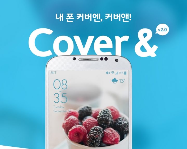
SKT’s Cover& v2.0 is a sequel to locksceen mobile application ‘SKT Cover&’ from designfever that launched on June 4th, 2014.
designfever was responsible for the project and service design for Cover& v2.0, using the existing framework from the original Cover& and analyzing user feedback to improve the applications usability and convenience while embracing its original identity. SKT Cover& v2.0 brought a new level of user experience upon its release via Google Play & SKT’s T-Store on February 17th, 2015.
UI – Clear & Intuitive
The main purpose of the project was to create a differentiated experience from the original Cover&. When creating the updated version of Cover&, designfever focused on improving 3 key aspects of the original application; UI, design and service. The user interface was enhanced to let users more easily understand how to use the application. We also added details in graphics and interactive design while focusing on making it more life-centered based on user feedback.
Design – Detail Focused
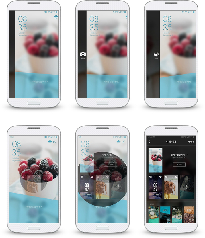
In addition to design of the existing Cover& application, we focused on improving numerous details that increased the app’s overall completeness. The shortcuts feature was designed to allow users quickly access preset apps with a light swipe. To avoid confusion with the unlocking gesture (a strong swipe), the app recognizes a user’s swiping speed and displays the appropriate feature, minimizing any discomfort for the user. Users can access the background decoration feature with a double-tapping gesture that was linked to the shortcuts feature in the original Cover& application. In addition, when the user enters the background decoration feature, a ripping effect is created by their fingertips.
Service – Life-Centered
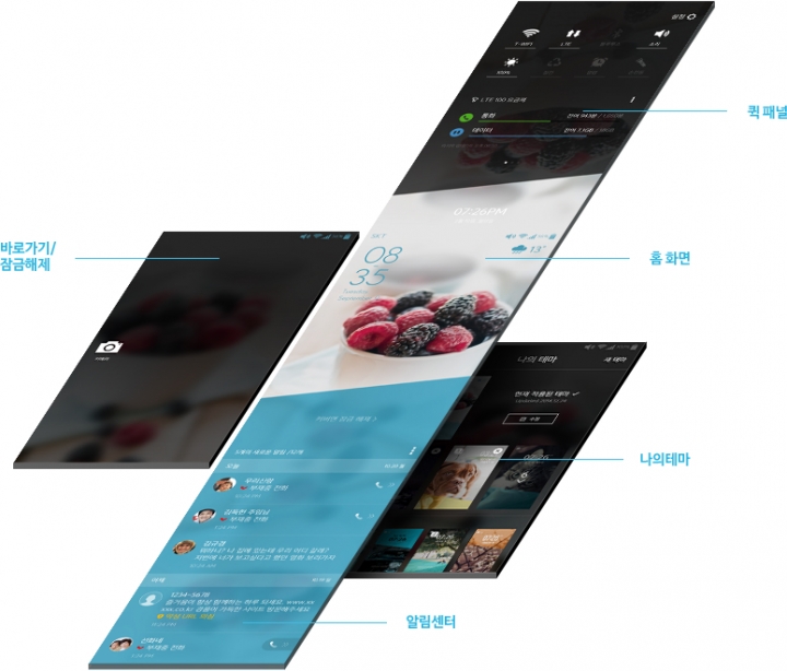
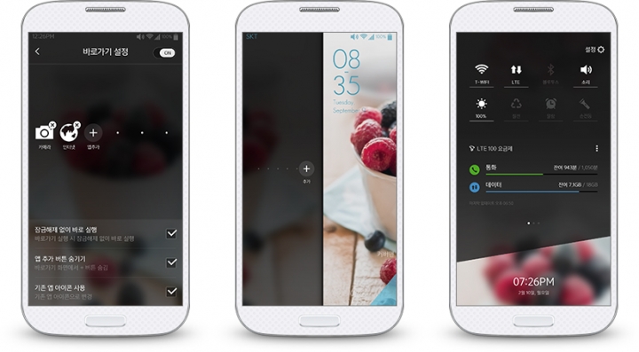
We improved the application’s service by gathering and analyzing user feedback to increase its level of usability and convenience. To enhance convenience, we increased the number of shortcuts that users can pre-set, up to 6. In the ‘Quick Panel’, we also included an additional set of features that users use most often, such as setting an alarms or enabling a flashlight.
Shortcuts: Faster than Unlocking
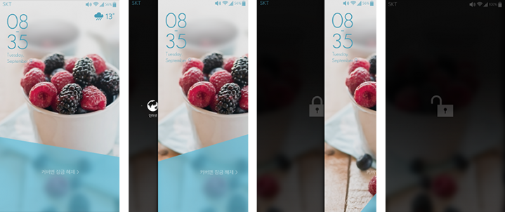
To enhance convenience, we increased the number of shortcuts that users can pre-set, up to 6. We borrowed the swipe gesture that most smartphone users are familiar with and applied it as a shortcut feature, allowing them to use it in a familiar way. A strong swipe unlocks the lockscreen while a light swipe runs shortcuts feature. Users can execute the appropriate feature depending on how they swipe.
Background Decoration: Easier and More Interesting
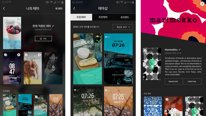
A wide variety of design sources were added including various clocks and layer options. We also added image rolling capabilities so that the user can experience a new image every time they start the screen. In addition, we expanded the Cover& experience by creating the ‘’Brand’ feature, providing unique artwork created from collaborations between famous brands and Cover&.
Quick Panel: Essential Features Only
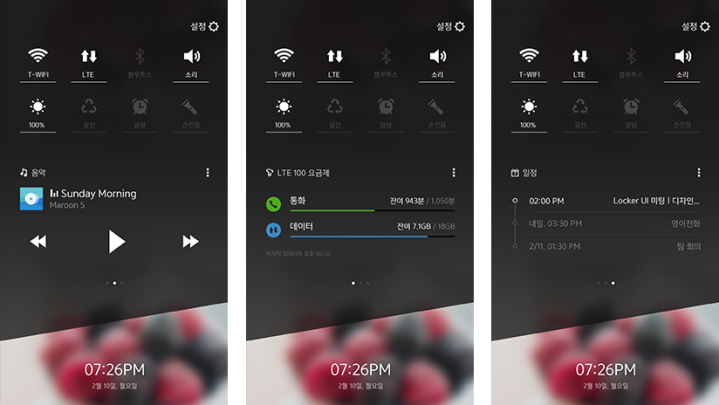
The ‘Quick Panel’ allows users to enable the features used most often, without having to depart from the lockscreen. We also included an additional set of features and widgets to enhance usability, such as quickly checking the amount of data consumption, enabling a flashlight, checking the schudule and controlling your music selection.
Notification Center: One-Dimensional Upgrade
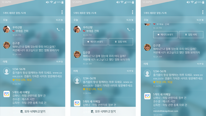
A new feature increased convenience by letting users turn off any unnecessary notifications, allowing the notification center to run faster. When there’s a missed call, user can send a message or simply call back via notification center. Users can also give a reply or register phrases as spam without unlocking the lockscreen. A temporary blur effect is used to display notifications, allowing the user to focus on new alerts.
Application Download | Project Page | Project Video | designfever

