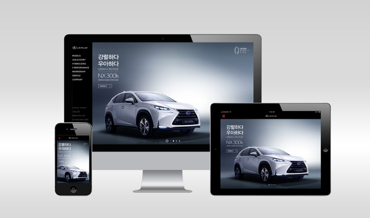
Lexus focused on the latest digital trends when renewing their website to serve as a window for their newly established brand identity.
designfever was responsible for the entire website renewal, ensuring improved accessibility and usability while maintaining Lexus’ progressive luxury brand image. In order to provide an optimized user experience across all types of devices, designfever applied responsive web technology to introduce vehicles and test drive applications.
Lexus already exists as a luxury brand, but wants to differentiate itself as a forward-thinking progressive brand by among the more youthful audience. Within Korea, recent campaigns for the CT, Lexus IS and Hybrid Zero demonstrate the brand breaking away from their previous image. In order to maintain the same trends, Lexus’ official website required a consistent UI/UX to server as the center for all online marketing and sales activities. In order to emphasize the brands progressive image, we planned a site where users could easily and conveniently access information at any time from any device.
Less Hassle
In order to reflect the user’s attitude, we created a site that was optimized for a variety of devices in order to deliver a digital experience that showed significant improvements from the previous version. Not only is it optimized for all browsers (Chrome, Safari, IE, etc.), users will also find the same interface regardless of it they are accessing site from a computer or on their mobile, delivering a consistent user experience that allows visitors to quickly identify and understand the website’s content.
Less Clicking
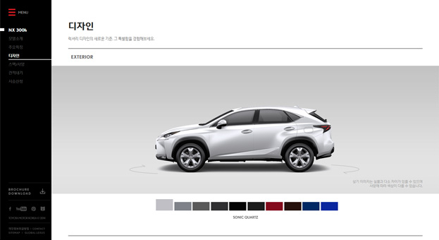
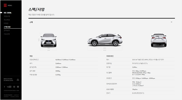
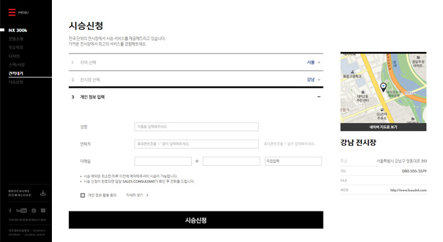
designfever focused on improving the previous website’s shortcoming, including complex page processes, duplicate content, and a website structure that was difficult to understand. Depending on the nature of the content, designfever integrated different categories and simplified the menu so that users could easily find the information they want. The intuitive navigation allowed users to easily move around to the site, while providing improved accessibility to the main menu. The core of the site revolves around the vehicle pages, demonstrating their features in hopes of users asking for a test drive, thus streamlining the sales process. In addition, customer inquiries can be responded to in real-time, ensuring effective and smooth communication..
Less Reading
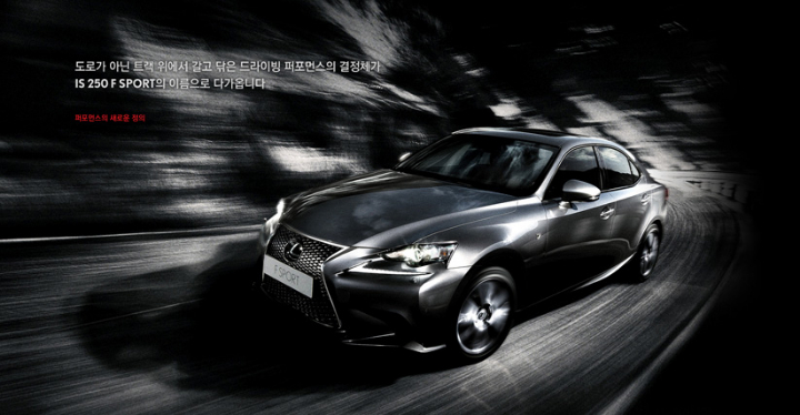
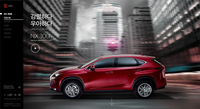
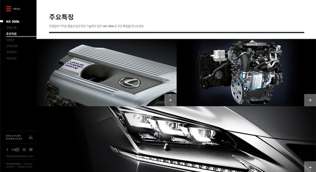
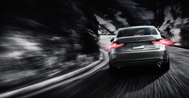
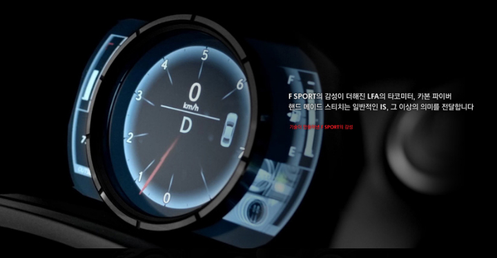
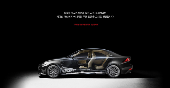
designfever increased the proportion of multimedia, including images and video, while reduced the amount of text-based content on the site. One of the main goals was to maintain Lexus’ progressive luxury brand identity by creating a strong brand message. Users are immersed in the large, sometimes moving, images that fill the screen, completing the brand look while enhancing the feeling of progressive luxury.
Less Thinking
designfever configured key visual zone and banners on the right-side of the screen to ensure easy access to newly branded contents including marketing promotions and new vehicle launches. designfever took advantage of including short clips and images in key visual zone to capture user’s interests while exposing important content on banners on the right to provide a variety of information. The site was designed by considering the user flow, allowing users to access the content by predicting the users’ next action.
Lexus Website | Project Video | Project Page | designfever

